Enhancing a mortgage blog's user experience through strategic design
Client
Draper and Kramer Mortgage Corp.
Industry
Mortgage
Year
2024
Platform
Web, Mobile
Roles
UI/UX Design, Development
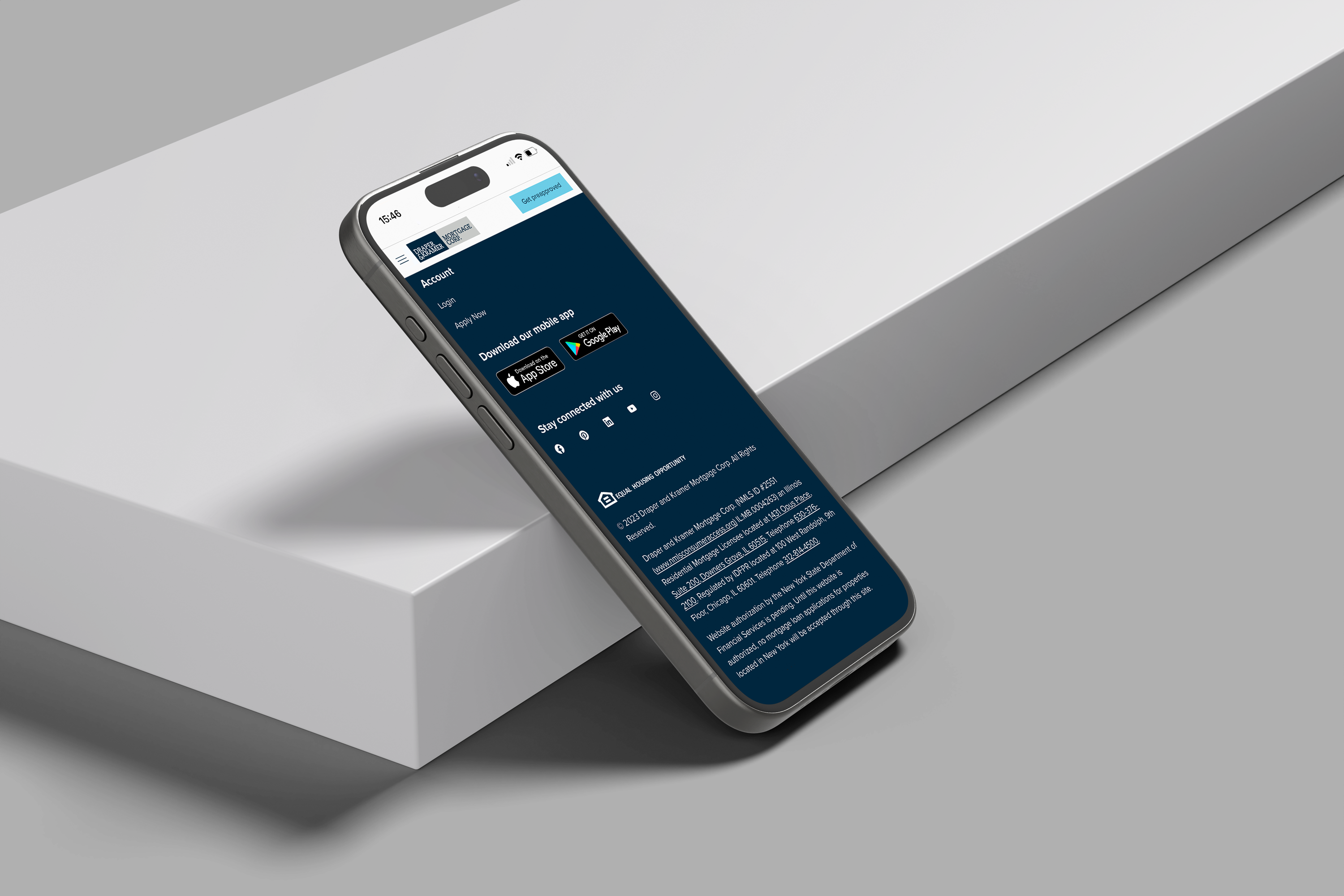
Updated blog homepage design with improved navigation and added call to actions (apply for home loan, app download links in footer, and social feed to create brand awareness)
The challenge? Optimize and transform the blog site. The goal was to improve user experience, reduce load times, automate lengthy processes, and create clear call to actions throughout the website.

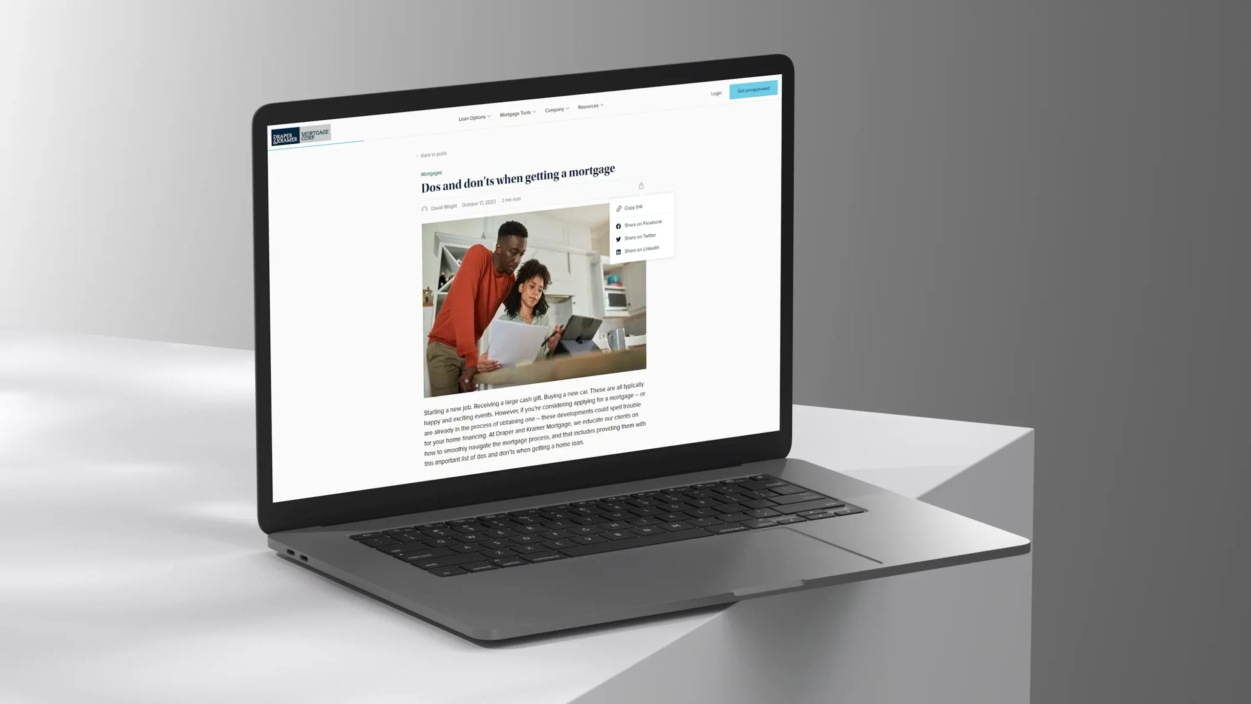
On top of a visual refresh, blog posts now have read time, share links, and scroll tracker at the top so the user easily has access to information and time commitment for each blog post
The outcome? A polished blog site that reflected Draper and Kramer Mortgage Corp’s updated brand identity as well as a more user-friendly experience to increase conversions.


After launch, we were able to see a significant improvement throughout the website:
- Improved site load times by 75%
- Reduced website storage from 64GB to 1GB
- Saved 40+ hours a month through process automation
- Improved user experience through visuals, heirechy and flow
- Optimized SEO to improve traffic and organic search
Tagged Case Study